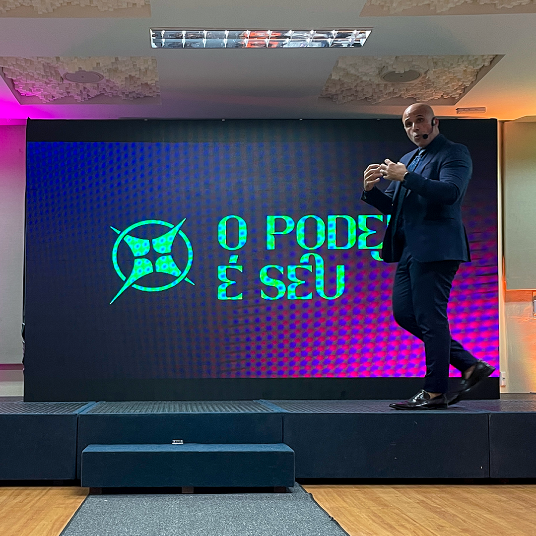
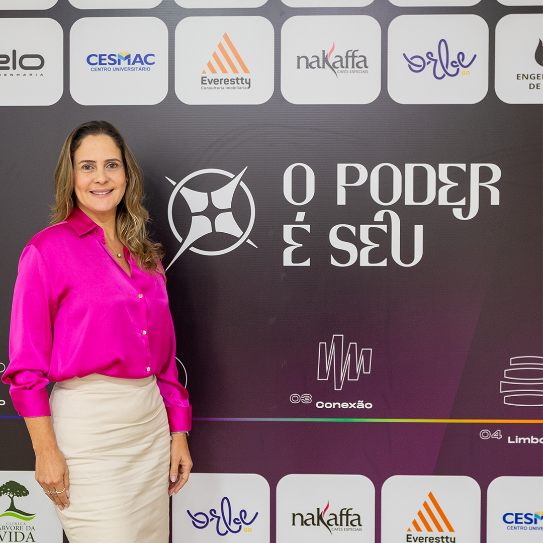
O Poder é Seu was an event introducing hypnotherapy to the public in Maceió, aimed at entrepreneurs and the development of their businesses through this practice. In a simple and accessible way, the idea was to apply it correctly and consciously to the audience’s personal, family, and professional lives.
The clients came to us with the idea and desire to hold a hypnotherapy event. From there, we began the creative process with a brainstorming session to develop the entire concept, from the initial idea to the final event delivery — covering brand creation, communication, signage, support materials, promotion, and coverage.
The process of creating the visual identity was divided into stages: gathering references, meeting to decide which ones to use, developing possible symbols, presenting them, and making the final selection. Among the proposals, the chosen one best represented the main concept — linked to individual expansion, breaking through, and overcoming mental barriers.
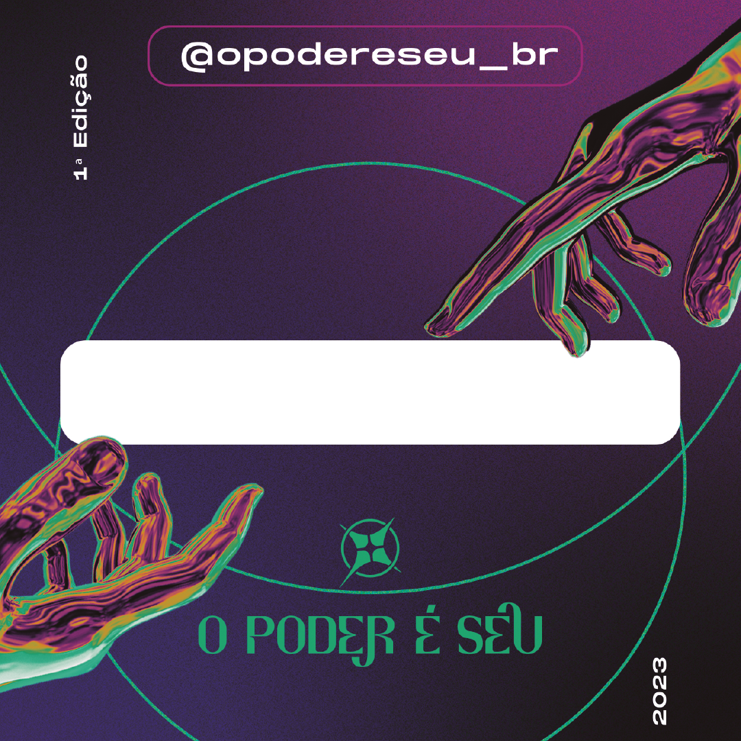
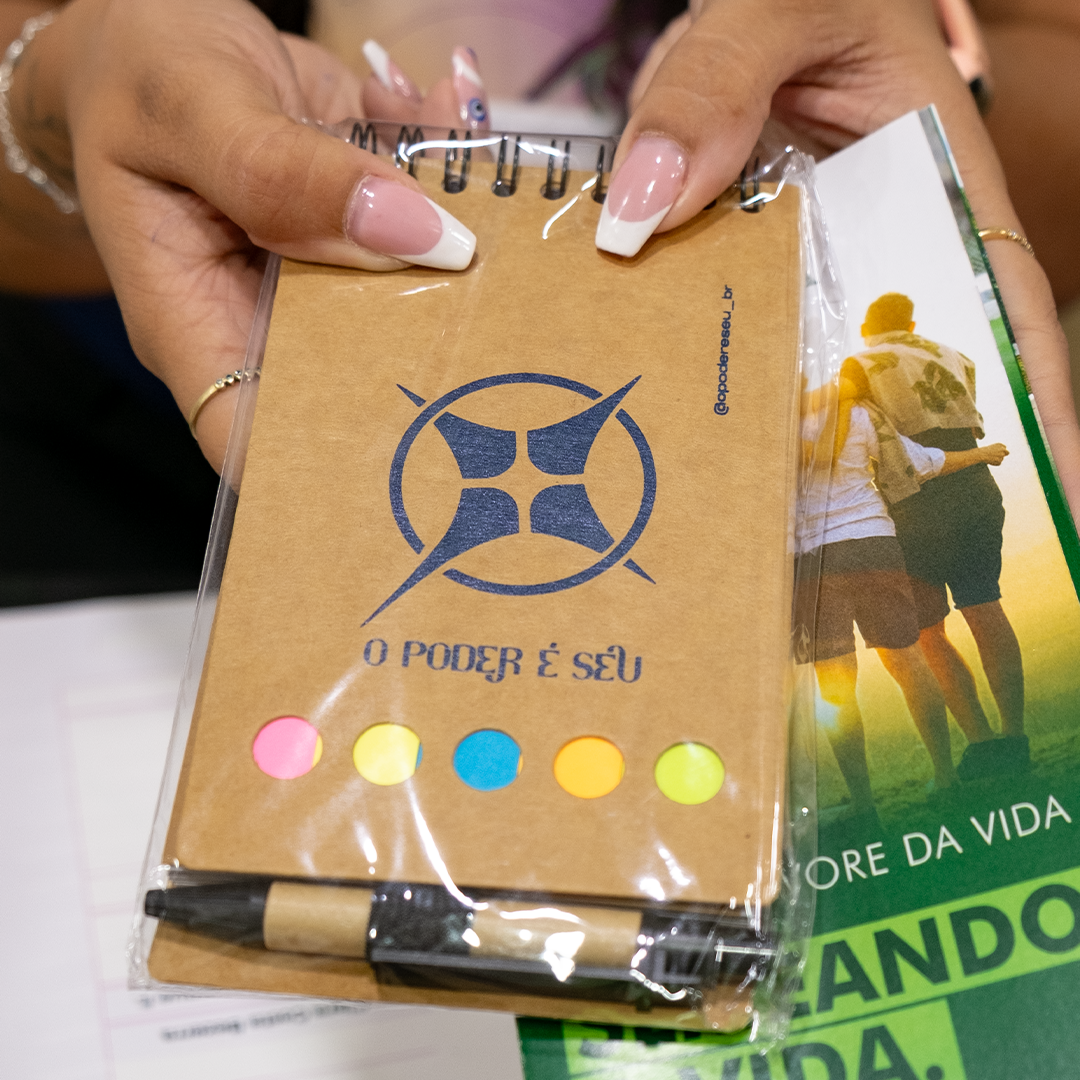
The star was chosen to symbolize this, and its shape guided the design of the final logo symbol. Each individual is unique, so we used a central point to represent the inner restlessness necessary for change, as transformation happens from the inside out. We also incorporated the idea that knowledge is in constant evolution, and to represent this concept, we used an “explosion,” which can symbolize both a starting point and a rupture leading to new expansion. A sense of movement was integrated into the shape, with one of the four points larger than the others, indicating upward growth from left to right.
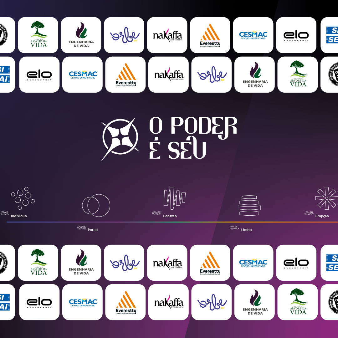
To complement the visual identity, we developed additional icons, each with its own color, to represent the audience’s experience during the event: individual (each participant), portal (entry into the event), connection (relationships formed during the event), limbo (moments of individual absorption and reflection), and eruption (the individual transformation achieved). This way, the participant’s journey from arrival to departure was represented.
The typography was chosen and customized to convey seriousness, personality, and strong legibility, with unique features. The colors, blended with gradients, represented modernity, exclusivity, boldness, and informality.
The communication strategy focused on demystifying hypnotherapy — showing that it is not something magical, but rather the power of one’s own mind. This was applied in the visuals, texts, and captions, always adapting the language to reach the target audience, made up of a more mature public less active on social media. For this reason, we also used other media, such as radio, billboards, WhatsApp, websites, newspapers, and digital signage.
Direct contact with both speakers and the audience, through interviews to understand their expectations, allowed us to produce and deliver organic content that naturally attracted and engaged participants. During event coverage, audiovisual content was captured and edited in real time, with the entire team on-site working in sync.
Teamwork, from the start of the creative process to the conclusion of the event, was crucial to the success of this case, helping us grow and advance professionally, especially as a team.
Credits: